Azeulead is a talent development consultating firm that helps companies or individuals with career-ready knowledge and skillsets through personalized training. They approached me with a new vision to launch a new workforce development business focused in the semiconductor industry.
They needed help finding a starting point and wanted something simple as a foundation within their budget. The timeline of this project took a total of 4 weeks. By the end of the project, I designed and launched a website that successfully presented a mission to investors and potential partners.
I interviewed my client about their goals to gain some context and insight of their problem. My client explained this website would serve as a key communication tool during early-stage outreach. They had some ideas of the website’s content, but they overall lacked the specific structure of what each page should hold. Additionally, they had trouble figuring out their branding.

The website needed to appeal to potential investors and partners as a professional, trustworthy, and viable business.

There was no existing site or platform to explain her business model, which made it hard for her to make a strong first impression.

She hadn’t yet defined her brand tone, visual language, or personality, making it hard to design something cohesive and targeted

While she had ideas for pages like “About” or “Resources,” she didn’t know what information belonged where, or how to present it for maximum clarity and impact.

To understand how to position my client’s brand within the semiconductor industry, I researched established players like Nvidia, AMD, and Qualcomm.
Part of my research focused on tone, messaging, and credibility markers. I analyzed how these companies communicated with their audiences, how they balanced technical content with business value, and what signals built trust with investors. This gave me a framework for creating a site that feels credible in a technical space while still telling my client’s human-focused workforce development story.


Apply industry-standard visual styles to build trust and convey professionalism to investors
Showcase not only what my client’s business do, but why it matters
Ensure the site speaks to investors, educators, and business partners
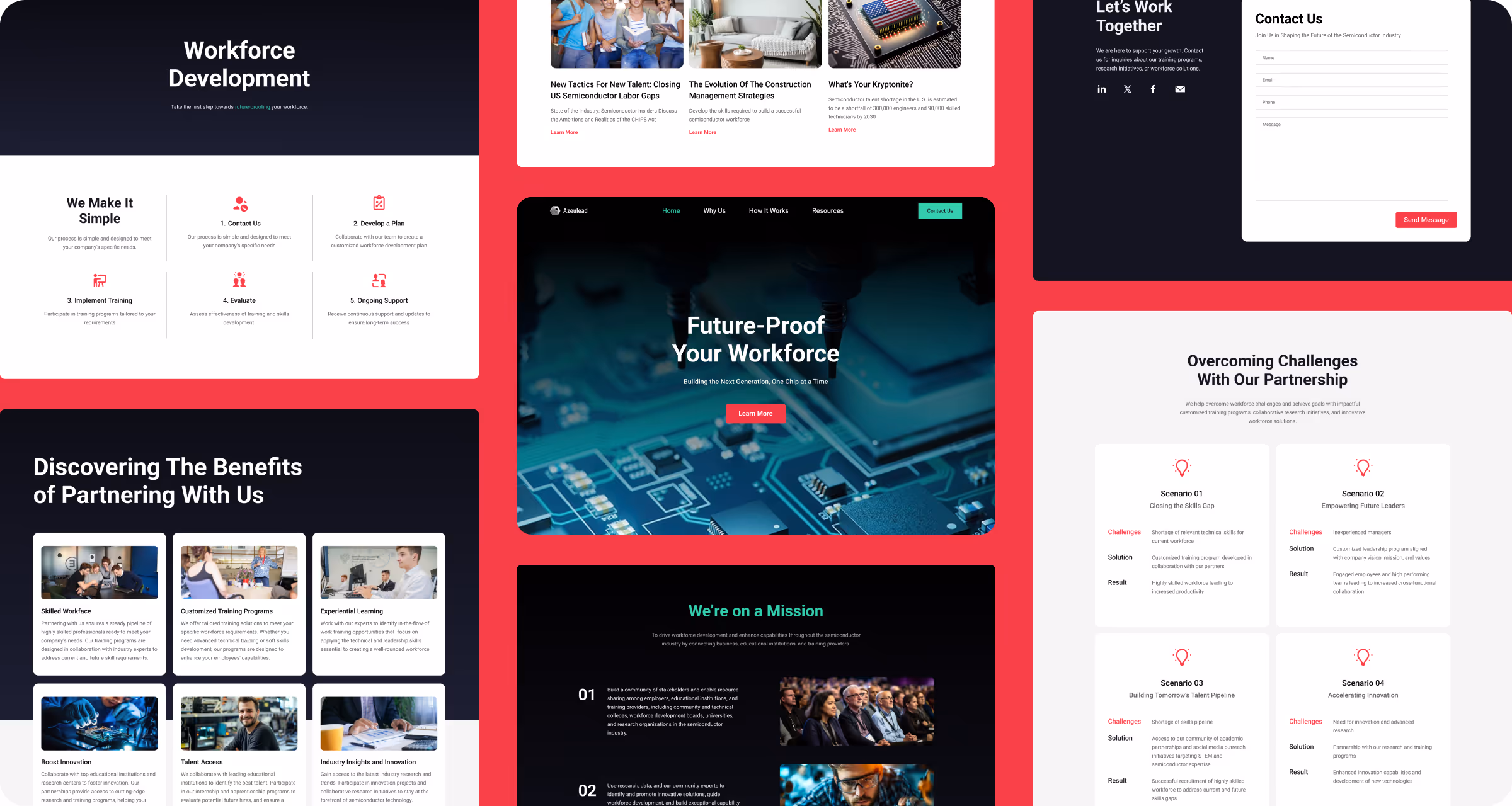
I structured the website around five key pages Home, Why Us, How It Works, Resources, and Contact. For each page, I outlined each section and organized the written content provided by my client. Low-fidelity wireframes helped test layout and content hierarchy before moving into visual design.

I used a deep blue (#131420) as the primary background. Dark blue-black hues are commonly associated with cutting-edge technology, engineering, and advanced research. For contrast, I used a high energy red (#E82E48) and tech green (#40DEAE) as main accents. The red introduces energy, while the green balances it out with freshness.
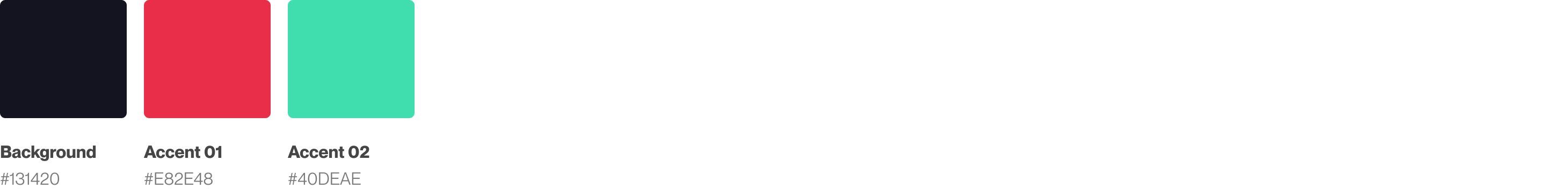
I created different color ramps using TailwindCSS framework, making it easier to generate gradients.


The Resource page will host their blogs, articles, and podcasts, making users stay informed and come back for future content.
The Contact Us page allows for a simple way to reach out for business inquiries and services.
This project taught me the importance of not only aligning design with audience and business goals, but also planning for how to measure the impact of the design after launch.
While websites like Nvidia and Qualcomm helped establish a design language investors could trust, workforce development sites could have better reflected the client’s mission on human impact.
I would implement tools like Google Analytics to track engagement, bounce rates, and time on page, specially on the “Why Us” and “How It Works” pages. If the site were to grow into a platform with more interaction or user flows, tools like Pendo could offer even deeper behavior tracking.
